
Click here?
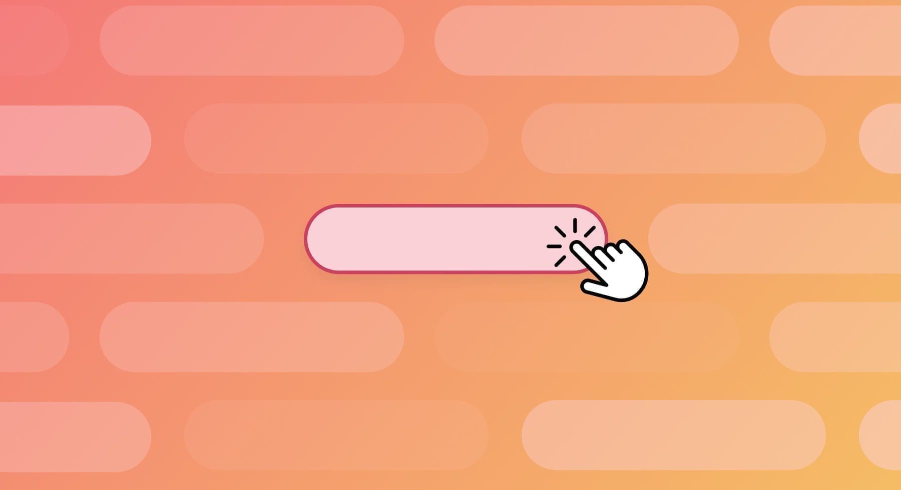
Not anymore. Those days are long gone, when users would click on whatever hyperlink you put in front of them. But the innocence of the internet is long passed, leaving in its wake innumerable examples of spamming, phishing, malware, and crapulous websites that have made users much more suspicious of any link, especially vague links like “Click Here” or “Learn More”.
Users have indeed learned more–not to trust vague links.
So you need to implement more creative and effective ways of inviting users to explore whatever hyperlinks you add to your website.
Follow the Eyes
The mantra of the Watergate investigation was “follow the money.” To understand how users interact with your content, it’s “follow the eyes.” That is, it is imperative to determine where the eyes of a user actually go on your website. This kind of data can really help you see the world through a robust UI lens.
What happens when users get to a generic hyperlink like “Click Here”?
For starters, it seems as if users come to your website ready to hunt for specific keywords and phrases, and according to one study, they only read about one-fourth of the words on a page. When you do the math, that means 75% of what you’ve painstakingly written is pretty much ignored (ouch).
In other words, users are skimming like college students cramming for finals, and a generic hyperlink is just so much background noise easily overlooked in the quest for the information that users are searching for.
Who Goes There?
Ignoring a hyperlink is one thing. Being afraid of it is another ball of wax.
The best UX does NOT involve creating paranoia in your users, and if you rely on the old standards of Click Here and Learn More, then your users are going to assume that cybercriminals have taken over your web design. You don’t want users thinking your content might get their identity stolen or a dose of malware.
Because, honestly, when was the last time you clicked on a Learn More link? Exactly. If you don’t know where the link is taking you, chances are, you’re dipping.
BTW: No One Is Clicking
We’ve outlined a couple of good reasons not to use Click Here or Learn More, but the point may be moot because it turns out that users just aren’t clicking on those kinds of generic hyperlinks anyway.
They might be using voice activation or tapping on screens. For those who use a screen reader, a series of identical generic links might prove to be frustrating. Web accessibility means that you need to give differently-abled users more in the way of context to explain what the link actually is.
No Verbs
Hey, don’t take our advice about this. Listen to the people whose job it is to make the web work the best it can. That’s right, the World Wide Web Consortium (W3C) has weighed in on the Click Here issue. They’ve issued a kind of “do-this and don’t-do-that” compendium of how to handle hyperlinks.
They are unequivocal: don’t use “Click Here”.
In fact, when it comes to embedding hyperlinks in your content, the W3C has banished all verbs. That’s right, their advice is to leave out all verbs from any highlighted link. So that takes care of Click and Learn, not to mention Go and Get and every other command action word you might use as a CTA.
You can use verbs, of course, but as part of the link. So in the phrase Get a Free Quote on Your Car Insurance, the “Get” should be left out of the link.
No Mechanics
Another key piece of advice on hyperlinks that the W3C gives is to avoid talking about mechanics, or the tendency of web developers to overshare when it comes to describing why an embedded link might be useful to a user. They suggest keeping on the “subject of discourse,” which translates to sticking to the script, don’t get bogged down with inside-baseball-type verbiage.
They boil it down to this bromide: don’t talk about links, use them. Brief descriptions will attract users, and useful links will let them jump directly to the content you’re talking about.
No Repeats
If you’re going to add hyperlinks to your content, you should be sure to add a description that is unique to that link. If readers see the same wording for a link on a page, they’re going to assume that the link takes them to the same page. So don’t get lazy and become a robot. Take your time to make each link stand out.
Because of how readers interact with a website, usually reading in an F-shaped pattern, you need your descriptions not just to be unique but to have the most important keywords placed at the front–the first few words that users actually read. One study shows that users read the first two words of a link, meaning that you need to carefully consider how you present a link.
You Got This
Sergei and Larry (as I like to call Google’s founders) figured out long ago that the way to calculate the quality of a website is by determining how many other sites link into it. They used linear algebra as a novel way to invent the algorithm that changed the world. So links matter, but they need to be handled with care. Click Here and Learn More are relics of the age of Altavista and Lycos. You can step up your game with just a little more spit and polish.


Get started now
Start with a risk-free, no obligation proposal delivered to your inbox in one business day or less.
Get Started- 5-Star Rated Technical Partner
- 100% White Label - Sign our NDA
- 90-Day Code Guarantee