Best Practices for Data Visualization in Web Design for 2023

Data visualization is essentially the art of converting complex data into visual formats that are easy to understand. Imagine taking a complicated spreadsheet and transforming it into a vibrant pie chart or an engaging interactive map.
The reason we’re excited to explore data visualization is its significant role in making sense of the ever-growing sea of information. It helps transform numbers and text into something meaningful and interactive. Whether it’s a simple pie chart or a complex interactive diagram, the aim is to make information more accessible and engaging.
And here’s why you’ll want to stick around: we’ll delve into the best practices for incorporating data visualization in web design for 2023 and explain how HeyReliable.com can be your go-to resource for all things related to data visualization in web development. At HeyReliable.com, we believe in custom solutions tailored just for you. No plugins or automatic tools—just hand-coded designs that suit your specific needs.
Why is Data Visualization Important?
First and foremost, the digital world is overflowing with information. From blog posts and articles to data reports and user reviews, the sheer volume of content can be overwhelming for anyone visiting your site. Data visualization helps to cut through that noise. By displaying data in a visual format, you simplify complex information and make it more digestible. This not only enhances user understanding but also boosts interaction, keeping your visitors more engaged.
But the benefits don’t stop at user engagement. Data visualization also brings a sense of interactivity to your site. Let’s be honest, who wouldn’t prefer an interactive map over a table filled with numbers? Interactive elements invite users to engage, click, and explore, which in turn increases the time spent on your site—a positive signal for search engine rankings.
Moreover, visual elements can reinforce your brand’s identity. The colors, style, and types of visualizations you choose can all speak to who you are as a company. This can be a potent tool in strengthening your brand image and making your site more memorable.
Have you ever looked at a spreadsheet and felt lost? We’ve all been there. Data visualization is a lifesaver in such situations. It can transform that puzzling spreadsheet into an intuitive bar graph or a pie chart. It provides an immediate context, making it easier to spot trends, understand outliers, and make more informed decisions.
While aesthetics are important, data visualization is not solely about making your website look pretty. It serves a functional role, helping users to better comprehend the information you present. This is crucial for sectors that rely heavily on data, such as finance, healthcare, or e-commerce, where a well-placed chart can make the difference between a user bouncing off or completing a transaction.
In conclusion, data visualization serves as an essential tool in modern web design. Its role in simplifying complex data, increasing user engagement, and reinforcing brand identity cannot be overstated.
So, as you consider your next web development project, remember that data visualization isn’t just a ‘nice-to-have’; it’s a must-have. And when it comes to implementing it effectively, HeyReliable.com is more than equipped to meet your needs with our hand-coded, custom solutions.
Why Choose Hey Reliable?
When you’re considering diving into the world of data visualization, you might ask, “Who should I trust to bring my vision to life?” That’s where we come in. At HeyReliable.com, we believe in a philosophy that sets us apart in the bustling world of web design and development.
Firstly, each project we undertake is hand-coded from scratch. No shortcuts, no cutting corners. Why does this matter? When we hand-code, it means that every line of code is tailored to serve a purpose, ensuring that your website performs optimally. This approach also allows us to easily implement effective data visualization that aligns seamlessly with your site’s overall design and functionality.
We steer clear of converter tools and plugins that many others might use as a shortcut. Using such tools can lead to bloated, inefficient code that could slow down your website and result in a less-than-stellar user experience. Our commitment to hand-coding means you get a clean, streamlined, and efficient website, every single time.
But what if you’re an agency or a freelancer looking for a reliable developer partner? Well, HeyReliable.com is more than just a service; it’s a partnership. We work closely with agencies and freelancers to bring their creative visions to life, offering our expertise in data visualization among other web development solutions. By pooling our skills and resources, we can create websites that aren’t just functional but are also visually stunning and engaging.
So why do these aspects make HeyReliable.com a sound choice for your data visualization needs? Because we understand that effective data visualization is more than just slapping some charts and graphs onto a webpage. It involves thoughtful design, clean code, and a deep understanding of the user experience. And that’s precisely what we offer.
The bottom line? When you choose HeyReliable.com, you’re not just getting a service; you’re gaining a dedicated partner committed to achieving the highest standards in web development and data visualization. So if you’re looking for a team that’s invested in your success as much as their own, you’ve found the right place.
Core Techniques in Data Visualization
Data visualization is an expansive field with myriad ways to represent information. Knowing which technique to use when can make a significant difference in how your data is perceived and understood. In this section, we’ll discuss some foundational techniques that can help you make better design decisions.
While there are many ways to visualize data, five core techniques are commonly used and are well worth understanding:
- Bar Graphs and Column Charts: These are perfect for comparing quantities across categories. For instance, if you want to display monthly revenue figures, a bar graph could clearly and effectively convey that information.
- Line Charts: Ideal for showing trends over a period, line charts are the go-to option for tracking things like website traffic or stock market changes over time.
- Pie Charts: Best suited for showing proportions, pie charts can be a straightforward way to represent percentage breakdowns, like product sales by category.
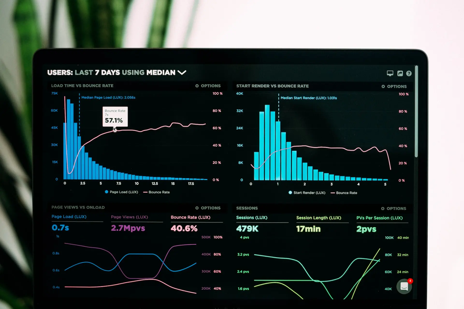
- Heatmaps: These offer an excellent way to represent complex data in an easy-to-understand format. Heatmaps can show how users interact with a webpage, allowing for better design decisions.
- Interactive Dashboards: Think of this as the control center for data. Dashboards allow users to interact with multiple data visualizations at once, giving a comprehensive view of the metrics.
At HeyReliable.com, we understand the importance of using the right technique for the job. That’s why we hand-code every project, allowing for total customization. Whether it’s selecting the right type of chart or designing an interactive dashboard, every decision is made to enhance user engagement and understanding.
It’s also worth noting that these techniques don’t operate in isolation. Combining them in innovative ways can provide a more complete picture and a richer user experience. For instance, embedding a line chart within an interactive dashboard allows users to see trends while also getting detailed data through other visual components.
Effective data visualization doesn’t just happen. It requires thoughtful design and execution, and that’s where we excel. By leveraging these core techniques, we create websites that not only look good but also make your data understandable and actionable.
In summary, understanding these core data visualization techniques can significantly impact how your audience interacts with your website. And when it comes to implementing these techniques in a way that resonates with your audience, HeyReliable.com has the skill and dedication you need.
How to Choose the Right Data Visualization Tools and Why They Matter
Choosing the right tools for data visualization is just as critical as selecting the appropriate techniques. The tools you choose can make or break the effectiveness of your visualizations. So how do you go about making that choice, and why is it so essential?
Simply put, data visualization tools are software applications or platforms designed to turn raw data into visual representations. They can range from simple charting libraries to complex platforms that allow for extensive customization and interactivity.
When selecting a tool, consider factors such as ease of use, customization options, and compatibility with your existing systems. The ideal tool should allow you to implement your chosen visualization techniques without unnecessary complexity.
Now, you might be wondering, “Why go through the hassle of hand-coding when there are so many tools out there?” At HeyReliable.com, we prefer hand-coding for several reasons:
- Customization: Hand-coded visualizations offer unparalleled customization options. You’re not limited by the features of a given tool; instead, you can create something that fits your specific needs.
- Performance: Hand-coding allows for cleaner, more efficient code, resulting in faster page loading times and a better user experience.
- Unique Design: With hand-coding, you’re not confined to templates. Every project can be a unique representation of your brand, making your website stand out from the crowd.
If you’re curious to see how these choices play out in real life, we offer a range of data visualization examples on our website. These case studies can give you a better sense of how choosing the right tools—and the right development partner—can make a world of difference in the effectiveness of your visualizations.
Choosing the right tools for data visualization is a decision that should not be taken lightly. While there are plenty of options out there, the customizability and performance of hand-coded solutions make them a compelling choice. And when you choose HeyReliable.com for your project, you’re selecting a partner that understands the nuances of tool selection and its impact on effective data visualization.
Real-world Applications of Data Visualization in Web Design
Understanding the theory and tools behind data visualization is valuable, but seeing how it applies to real-world scenarios can provide that “aha” moment. In this section, we’ll explore some practical applications where data visualization shines in web design.
For e-commerce websites, data visualization can serve as a powerful tool to showcase sales trends, popular items, or seasonal spikes. Rather than merely listing products, interactive visual elements can guide the shopper’s journey, providing insights into what others are buying and what might be of interest to them.
In the finance sector, data visualization can take complex data sets like stock market trends, investment portfolios, or economic indicators and present them in a way that’s easy to understand and act upon. An interactive dashboard can help users make informed decisions without wading through spreadsheets or financial jargon.
Healthcare platforms can utilize data visualization to display complex medical data like lab results, nutritional statistics, or exercise metrics. This visual representation can make it easier for users to understand their health conditions, track changes, and adhere to treatment plans.
Online learning platforms can also benefit from data visualization. By transforming dry, numerical data into visual formats, students can grasp complicated subjects more easily. This not only makes the learning experience more engaging but also aids in better information retention.
At HeyReliable.com, we specialize in crafting bespoke data visualization solutions for various industries. Whether it’s designing an interactive e-commerce platform or a health-tracking dashboard, our hand-coded, custom-built solutions ensure that you get precisely what you need.
The applicability of data visualization is extensive, cutting across multiple sectors and varying use-cases. Its capacity to turn complex data into actionable insights makes it invaluable in today’s information-heavy landscape. And if you’re looking to implement it in a way that’s both effective and aligned with your brand, HeyReliable.com is ready to assist you in creating something exceptional.
The Future of Data Visualization in Web Design
As technology evolves, so do the possibilities for data visualization. Being prepared for what’s coming next can give you a competitive edge. In this section, we’ll take a look at where data visualization is headed and how you can stay ahead of the curve.
One of the most significant trends we’re seeing is the rise of interactive data visualizations. Interactivity provides users with the opportunity to explore data on their terms, diving deeper into areas that interest them and thus fostering increased engagement.
The lines between the physical and digital worlds continue to blur, and data visualization is no exception. Virtual and Augmented Reality (VR & AR) offer entirely new platforms to display data, creating immersive experiences that can enhance comprehension and retention.
The integration of Artificial Intelligence and Machine Learning can make data visualization smarter and more personalized. By analyzing user behavior, these technologies can help tailor visualizations to individual preferences, thereby improving user experience.
The world is moving faster than ever, and our expectations for real-time information are growing. Future data visualizations will increasingly focus on real-time updates, allowing for more timely and accurate decision-making.
As mobile devices become more powerful, the demand for effective data visualization on smaller screens will grow. Expect to see more mobile-optimized visual interfaces that provide the same depth of information as their desktop counterparts.
At HeyReliable.com, we’re excited about these future trends and are already incorporating them into our projects. We continually stay updated with the latest technologies and methods in data visualization. So when you partner with us, you’re not just getting current best practices—you’re also future-proofing your website.
The future of data visualization is rich with potential. As new technologies emerge and user expectations change, staying ahead of these trends can make a significant difference. If you’re excited about what the future holds and want to be part of it, HeyReliable.com is here to help you create a website that’s not just current, but forward-thinking as well.
Ready to Transform Your Website With Data Visualization?
You’ve journeyed through the essentials of data visualization, its real-world applications, and even peeked into its future. Now, the ball is in your court. If you’re keen to turn your website into an engaging, data-driven experience, why wait?
The first step to creating a standout website is easier than you think—simply reach out to us. At HeyReliable.com, we’re always eager to discuss your vision and how we can bring it to life. Every website has its own unique requirements and challenges. We thrive on crafting solutions that fit your exact needs. Don’t settle for off-the-shelf when you can get something made just for you.
We’re not just about meeting current standards; we’re about setting new ones. Partnering with HeyReliable.com means you’re investing in a future-ready website.Don’t let another day go by with a website that isn’t reaching its full potential. Contact us today and let’s make your data as compelling as your business.


Get started now
Start with a risk-free, no obligation proposal delivered to your inbox in one business day or less.
Get Started- 5-Star Rated Technical Partner
- 100% White Label - Sign our NDA
- 90-Day Code Guarantee