How to Create Content that Converts and Reduces Bounce Rates

Swish!
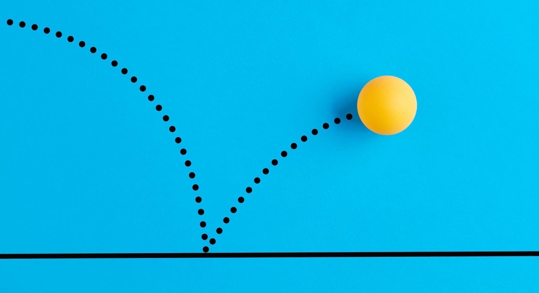
Eight seconds.
Your bank account, your business, your existence: if your website is your lifeblood, then studies show that you have eight seconds to grab the eyeballs of a visitor before they bounce. Bounce is a word that sends chills down the spines of web designers because bounce rate is the gold standard used to measure the overall effectiveness of a website.
The mother of all questions is this: how can you get eyeballs to become more than mere visitors in eight lousy seconds? If users are bouncing from your website, how can you get them to stay a bit longer and maybe even convert? No, not switch religions, but heed your Call-To-Action (CTA) by shopping, signing up, or filling out a form.
That’s where the art of web design comes into play. While the sciences of psychology, physiology, and behavioral economics can help us understand how brains operate and the optic nerve functions, web design conjures the magical and the mysterious to capture those wandering eyeballs by combining visual and written artifacts into a wondrous display of color, sound, shape, and form.
Here are some guidelines on how to design a website that converts.
Don’t Clutter
Marie Kondo is right about your closet, and she’s right about your CTA. Tidying up is a key component of getting organized. Just like you shouldn’t keep that Foghat t-shirt that’s about two sizes too small, you shouldn’t clutter your website with more than one clearly defined CTA, whatever that happens to be.
One rule of thumb is that the more links you have on your website, the lower your conversion rate will be. When given too many choices to make, often users will simply shut down and bounce. This is a well-known finding of psychology, and yet adhering to it brings many design elements into play.
Where should you put your CTA? On a mobile device, clearly, the center of the screen is the preference for most users, but a desktop is a trickier matter because the CTA needs to sit in relation to other visual elements. Heat studies show how eyeballs rove across screens, but even though this data is widely available, not all websites convert at the same rate. The artistry of web design shows how logic can fail us in surprising ways. Truly inspired and visually stunning UX isn’t something that an algorithm can produce.
Oh, and green button CTAs get converted more than red ones (so the story goes).
Read All About It!
For centuries, people in the newspaper business have known that without a great headline, even a big story can get buried. Those grizzled ink-spotted vets of print media didn’t have the glossy analytics of today’s copy bloggers, who know from research that 80% of users will just read the headlines of a webpage, meaning that your headers need to have some real juice in them if you want to boost your conversion rate.
But it’s not just the words of a headline, which need to convey an urgent, unique, emotional appeal, but also the design arrangement of the so-called informational hierarchy. In other words, you need to utilize spacing and font size to rank-order the information presented, starting with the most critical (in your opinion), so that the user can flow through the array and land on the CTA.
The key design element is creating contrast with your H1 and H2 headlines so that users will feel compelled to dive into more specific content. If you can combine smart information flow with information that’s actually useful to the user, you will see your conversion rate skyrocket. But like web design, writing copy that converts is more art than science.
One of the most famous headlines in history is from the New York Daily News during NYC’s 1970s fiscal crisis: FORD TO CITY: DROP DEAD. It is urgent, emotional, pithy, and unique. The headline tells the story. And it’s a very difficult stunt to pull off, so you need to work at it.
The Squint Test
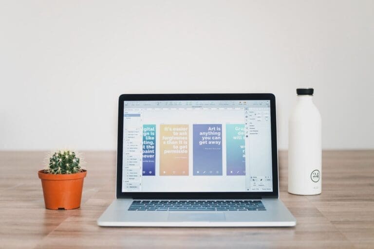
One of the more interesting ways to test how well the visuals of your web design work is to take “the squint test.” If you can get your eyes to blur all the words on the screen but can still make out the images, can you still figure out the main focus of your website?
If you can’t, then you might need to rethink the images that you’re using and why you’re using them. The “hero shot”–the first image that a user will see–should be of a person, and not a product, according to one school of thought, because people relate better to other people than to inanimate objects. And using people who are smiling, happy, and joyful seems to correlate with improved conversion rates.
Those happy, smiling people should be offering users visual cues to direct them to the CTA. Just like headlines need to flow in an informational hierarchy, your images should support a visual hierarchy so that users will get where you want them to. Smart use of whitespace will aid in shepherding users to the CTA.
But whatever images you select, you have to keep in mind that users will experience these images on various platforms in differing environments. Most desktops will have interior light and big screens, while smartphones could be inside, outside, both, and on devices that are state-of-the-art or on their last technological legs. So images need to be versatile and if their appeal comes from some little visual nuance, that’s probably a deal-breaker because most users will just get confused.
Color Me Converted
Ask any teacher and they’ll tell you that the color on the walls of a classroom will influence the general mood of the students. Research has backed that up, and so the last web design component to consider is how to use colors to create the effect you want.
While users might subconsciously relate colors to certain emotions, the main design element to work out is how the colors on your page contrast with each other. You don’t want to overload your page with more than four colors, and you can’t mix certain combinations because of the contrast (think pale green with yellow).
That’s why you should A/B Test just about everything color-related. You need to see how the background color of your landing page works with the container of your CTA button or your forms. Don’t assume anything and keep all of your options open.
Stay on Brand
The most important caveat about designing content that converts is to stay on brand, which means staying consistent. Your CTA should be the main focus, which means your web design needs to buttress the brand you’ve been building. Consistency is crucial for UX that leads to lasting relationships. Knowing who and what you are is the main driver of a well-designed website.


Get started now
Start with a risk-free, no obligation proposal delivered to your inbox in one business day or less.
Get Started- 5-Star Rated Technical Partner
- 100% White Label - Sign our NDA
- 90-Day Code Guarantee