
Have you ever found yourself pinching, zooming, and scrolling sideways to view a website on your phone? It’s a bit like trying to fit a square peg into a round hole, isn’t it? Well, that’s where responsive web design comes into play, and it’s something we take to heart here at heyreliable.com.

Imagine a web where every site glides smoothly across your screen, no matter the device. That’s the web we believe in – one that’s accessible, user-friendly, and where the experience is seamless whether you’re on a desktop or tapping away on your smartphone. This adaptability is not just a convenience; it’s become a basic expectation for web users everywhere.
So, why is responsive web design at the forefront of creating a stellar online presence? And why is it so important for your business’s digital facade? Stick around as we unfold the story of responsive web design – the what, the why, and the how – and how we, at heyreliable.com, craft these experiences from the ground up, without relying on shortcuts or cookie-cutter tools.
Understanding Responsive Web Design
So, what exactly is responsive web design? At its core, it’s a way to build websites that detect the visitor’s screen size and orientation and change the layout accordingly. It’s about creating flexible and responsive web pages that adapt to the user’s behavior and environment based on screen size, platform, and orientation.
When we speak of responsiveness in web design, we’re not just talking about a website that can shrink and grow. It’s about a design that responds to the user’s needs and provides the optimal viewing experience – easy reading and navigation with a minimum of resizing, panning, and scrolling. Think of it as a one-size-fits-all approach to web design that ensures your website looks good and works well, no matter where it’s viewed.
At heyreliable.com, we understand that every pixel counts. We meticulously hand-code from scratch, ensuring every element, from images to typography, aligns perfectly on any screen. By shunning converter tools and pre-packaged plugins, we ensure that our responsive designs are custom-tailored to meet the unique needs of each website we work on.
This level of detail matters because responsive design isn’t just about visual appeal; it’s about functionality. It’s about making sure that your website isn’t just a static entity but a dynamic one that engages users effectively, no matter how they access it. Whether it’s a text that adjusts to the perfect reading size on a mobile phone or a desktop layout that makes the most of a larger screen for easier navigation, responsive web design makes it possible.
Why do we go to these lengths? Because in the vast ocean of digital content, the experience of the user is king. A website that responds to its user’s needs doesn’t just tell them they’re valued; it shows them. And in an age where digital convenience is paramount, delivering a responsive website is akin to rolling out the red carpet for your visitors.
In the following sections, we’ll explore why this flexibility is so critical and how it impacts not just user experience but also the credibility and success of your digital footprint. Stay tuned as we delve into the intricacies of why responsive web design is a cornerstone of modern web development and how, at heyreliable.com, we craft these experiences with precision and care.
The Significance of Responsive Web Design
Firstly, think about the sheer variety of devices used to access the internet today. From the palm-sized smartphones to the expansive desktop monitors, each device offers a unique window to your website. Responsive web design ensures that this window presents a view that is not only clear but also engaging, no matter the size. It’s the difference between a welcome mat and a “Do Not Enter” sign at the front door of your digital home.
But it’s not just about looking good. Responsive web design is about meeting users where they are, and today, they are everywhere. People browse while commuting, from the comfort of their couches, at their office desks, even while queuing for coffee. Each situation demands a different approach to content layout and interactivity. A responsive website automatically adjusts to each of these scenarios, providing a consistent experience that keeps users coming back.
For businesses, this adaptability translates directly to reach and engagement. Consider search engine rankings: search engines, like Google, prioritize mobile-friendly websites. A responsive website is inherently mobile-friendly, and this is key because most people now use mobile devices as their primary means of online access. If your website is not responsive, you’re not just missing out on a quality user experience; you’re also missing out on potential visibility and traffic.
Moreover, there’s the cost and time efficiency to consider. Maintaining separate sites for mobile and desktop users is cumbersome and inefficient. Responsive design allows you to create a single website that caters to all users, cutting down on development time and ongoing maintenance costs. It’s like building a vehicle that can transform into a car, a plane, or a boat, depending on the travel need; it’s economical and downright smart.
At heyreliable.com, we understand the significance of these details. As a developer partner for agencies and freelancers, we champion the cause of responsive web design by meticulously hand-coding websites that provide an impeccable user experience. We do not cut corners with convertor tools or plugins because we believe in creating bespoke solutions that stand the test of time and technology.
Let’s face it, in the fast-paced web arena, responsiveness is not just about adapting to now, but being ready for the future. A website that is responsive is built on a foundation that is ready to evolve, ready to meet the next wave of devices and user habits with grace and efficiency.
As we move on, remember, a responsive website is not just a technical achievement; it’s a commitment to user inclusivity, future-proofing, and business acumen. It’s a loud and clear message to your audience that you value their experience and their time. And isn’t that what every user is ultimately looking for?
Hand-Coding: The heyreliable.com Method
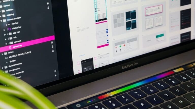
When it comes to crafting a website that’s truly responsive, the method behind the magic (excuse the casual term) is just as important as the outcome. At heyreliable.com, we’re a bit old-school in our approach – we believe in hand-coding websites from the ground up. It’s our signature method, and there’s a good reason why we swear by it.
Hand-coding is the art of creating websites with pure code – HTML, CSS, and JavaScript – written line by line by a developer. Think of it as a tailor making a suit; it’s cut to fit perfectly, with attention to every stitch. This artisan approach to web development allows for meticulous control over the layout, feel, and behavior of a website on any device it’s viewed on.
So, why do we eschew converter tools and plugins? Well, these automated shortcuts are like off-the-rack suits; they might fit okay, but they’re not designed with your specific measurements in mind. They can introduce unnecessary bulk, compromise on speed, and often, they don’t translate well across different screen sizes and devices.
Our method ensures that the code is clean, lean, and fully optimized. Hand-coded websites load faster because they don’t have the extra baggage of unused code that often comes with templated designs or website builders. Faster load times mean better user engagement and improved search engine rankings – it’s a win-win.
But hand-coding offers more than just performance benefits. It provides a level of customization that is unparalleled. When we build a website for you, we’re considering your brand’s personality, your specific functionality needs, and how your users will interact with your content. Every button, every transition, and every layout decision is made with intention, without the constraints that templates impose.
Moreover, hand-coding makes websites more secure. By understanding and implementing every line of code, we minimize the risk of security loopholes often found in third-party plugins. This attention to detail is part of our DNA at heyreliable.com. We’re not just building websites; we’re crafting digital experiences that stand strong against the tides of change and technology.
We’re also your behind-the-scenes ally. As a partner for agencies and freelancers, we know that your projects are your reputation, and in turn, they become our reputation. By hand-coding websites, we ensure that your projects reflect the high standards of quality and care that you, and in turn, your clients expect.
Through hand-coding, we also make future updates and maintenance straightforward. Since the code is clean and well-organized, it’s easier to add features, tweak the design, or scale the entire website. It’s like having a well-organized tool shed; when it’s time to make changes, everything is right where you need it.
In the upcoming sections, we’ll show you examples of responsive web design in action and discuss the purpose and application of responsive web design in more detail. And remember, at heyreliable.com, we’re not just coding; we’re crafting your digital story with precision and dedication to responsiveness – one line of code at a time.

Real-World Examples of Responsive Web Design
Navigating the digital world, you’ve likely encountered websites that left you impressed with their ease of use and adaptability. That’s responsive web design in action, creating an effortless user experience. Here, we’ll showcase how responsive web design manifests in the real world and the impact it has on user interaction.
Responsive Web Design in E-Commerce
Take an e-commerce site, for example. A user might browse products on their mobile during a commute, then switch to a laptop for a closer look at home. A hand-coded responsive site ensures that images, product descriptions, and the checkout process are seamless and intuitive, no matter the device. This flexibility increases the likelihood of completing a purchase, showcasing the practical application of responsive web design principles.
News and Blogging Platforms
Consider news outlets and blogging platforms. With information consumption shifting heavily towards mobile devices, it’s essential that text-heavy sites are easily digestible on smaller screens. A responsive design ensures that paragraphs are well-spaced, images align correctly, and the site is navigable with simple thumb-scrolls, making the reading experience as comfortable on a phone as it is on a desktop.
Educational and Informational Sites
Educational resources, such as responsive web design tutorials on platforms like freecodecamp, need to be accessible across devices to facilitate learning anywhere, anytime. Whether it’s a student studying on a tablet or a developer coding along on a desktop, responsive design makes education adaptive to various learning environments.
Portfolios and Personal Websites
For freelancers and agencies, a portfolio that employs responsive web design exemplifies their commitment to current web standards. It’s a live showcase of their skills in creating a versatile, user-centric interface. This adaptability not only demonstrates technical skill but also exhibits a dedication to providing a quality user experience.
Corporate Websites
On the corporate front, a responsive website serves as a testament to a company’s professionalism and modern approach. It reflects an understanding of customer behavior and a willingness to cater to their needs, establishing trust and credibility.
Responsive Web Design Tools in Action
Tools like Bootstrap provide frameworks for creating responsive layouts with pre-designed responsive CSS code, which can be hand-tailored for customization. Meanwhile, CSS media queries allow developers to apply styles based on the specific characteristics of the device viewing the website, ensuring the responsive css code for all screen sizes is effective and efficient.
At heyreliable.com, we take inspiration from these real-world applications and strive to push the envelope further. By hand-coding responsive designs, we ensure that your website aligns perfectly with the needs of your business and your audience, transcending the ordinary to deliver a truly responsive experience. Our commitment to quality means your website won’t just be an example of responsive web design; it will set the standard for it.
The Purpose of Responsive Web Design
At its heart, responsive web design is about ensuring that your website is accessible to all users, regardless of their device. The goal is to provide a consistent and user-friendly experience whether someone is visiting your site from a smartphone, tablet, laptop, or desktop. This adaptability is especially vital in a world where internet access from mobile devices is swiftly becoming the norm.
A website that scales and transitions smoothly between various devices and screen sizes significantly improves the overall user experience. It’s about making sure that navigation feels natural, information is easy to find, and interactions are intuitive, no matter how you’re accessing the site. This level of care in design fosters a positive relationship with your visitors, encouraging them to stay longer and engage more deeply with your content.
Responsive web design also serves a critical role in search engine optimization (SEO). Search engines favor websites that are mobile-friendly, and a responsive design is a key factor in that. By meeting these criteria, your site can rank higher in search results, increasing your visibility and the likelihood of attracting more traffic.
From a business perspective, having a single responsive website is more cost-effective than maintaining separate versions for different devices. It simplifies the development process, reduces maintenance costs, and ensures that updates only need to be applied in one place. This efficiency means you can allocate resources where they’re needed most, rather than spending them on redundant web maintenance tasks.
Responsive web design isn’t just about the here and now; it’s also about preparing for the future. As new devices and screen sizes continue to emerge, a responsive site is well-equipped to handle those changes with minimal adjustments needed. This forward-thinking approach ensures that your website remains functional and appealing, even as the digital landscape evolves.
At heyreliable.com, we view responsive web design as the foundation upon which we build every project. We hand-code with the future in mind, creating websites that aren’t just responsive for today’s devices but are primed to adapt to tomorrow’s innovations as well. We dedicate ourselves to providing an end product that serves the purpose of being universally accessible, user-friendly, and poised to help your business grow in the ever-changing digital arena.
Why Choose Responsive Web Design for Your Project
Selecting the right design approach for your website is more than a strategic decision; it’s an investment in your audience’s experience and your brand’s digital presence. Responsive web design is not just a preference; it’s an essential component of modern web development. Here’s why opting for responsive web design is a wise choice for your project.
With the surge of mobile device usage, your audience is no longer just sitting behind desktops. They’re on their phones, tablets, in various settings, and at all times. Responsive web design ensures that your site is fully functional and appealing on any device, thereby catering to a broader audience and not missing out on mobile traffic.
By choosing a responsive design, you’re essentially streamlining the development process. You won’t need to create multiple versions of your site for different devices. This not only cuts down the initial development costs but also simplifies ongoing maintenance, since updates need to be done only once.
A responsive website provides a better user experience. Users are more likely to stay on a site that’s easy to navigate and read on their devices. By enhancing user engagement, you’re also boosting the chances of conversion – whether that means online sales, sign-ups, or inquiries – effectively driving your business goals forward.
In today’s competitive digital space, having a responsive website is no longer an advantage; it’s a standard. By ensuring your website is responsive, you’re staying competitive and meeting the expectations of users who demand a seamless experience across all platforms.
As mentioned, search engines prioritize mobile-friendly websites. Responsive design is inherently mobile-friendly and will help in improving your site’s SEO, making your content more discoverable and accessible to a larger audience.
The digital landscape is ever-evolving, with new devices and viewing contexts emerging regularly. A responsive website is future-proof in many ways, designed to look and function well no matter what the next device trend may be.
At heyreliable.com, we understand these imperatives deeply. We hand-code from scratch, ensuring every website we build is not only responsive but also optimized for performance, engagement, and conversions. We commit to these standards because we know it’s what it takes to make a site that stands out and meets the needs of users today and in the future. Your project deserves that level of attention and precision – and that’s what we aim to deliver with every line of code we write.
Implementing Responsive Web Design: A Guided Approach
As the digital space becomes more diverse, implementing responsive web design (RWD) has transitioned from being an innovative trend to a fundamental requirement. But how do you go about integrating this approach into your web project? Let’s walk through a guided approach to implementing RWD, keeping the process straightforward and manageable.
The foundation of RWD is a fluid grid system. This involves designing your layout in relative units like percentages, rather than fixed units like pixels. This fluidity allows your content to expand or contract naturally with the screen size, ensuring a consistent structure across devices.
Just as your grid should be flexible, so too should the media within it. Images, videos, and other media types should be able to adjust within your fluid grid. CSS features, such as max-width, object-fit, or even newer layout standards like CSS Grid, can help ensure your media content is as adaptable as your text.
Media queries are the cornerstone of RWD. They allow you to apply different sets of CSS rules based on the characteristics of the device or viewport, tailoring your site’s design to different screen sizes and resolutions. This is where the magic happens in ensuring your site responds to the user’s environment.
Ensure that your responsive site is not only visually appealing but also accessible and easy to navigate. This includes readable fonts, accessible menus, and touch-friendly elements. Good RWD is about delivering an inclusive user experience for everyone.
A responsive website needs to be efficient, especially on mobile devices with potentially slower internet connections. Optimizing images, minifying CSS and JavaScript, and leveraging caching can make a significant difference in load times, directly affecting user satisfaction.
Testing is critical. Your site should be tested across a range of devices and browsers to ensure consistency in the user experience. Tools and platforms are available that allow you to simulate how your site will look and behave on different devices.
Post-launch, gather and analyze user feedback. Observing how people interact with your site across different devices can provide insights into further refinements and optimizations.
At heyreliable.com, we take pride in our methodical approach to RWD. We craft from the ground up, avoiding shortcuts like converter tools or plugins, to ensure that every element of your website responds elegantly to any screen it encounters. We’re a developer partner for agencies and freelancers, and our expertise lies in creating websites that are as robust and adaptable as they are sleek and sophisticated. By implementing RWD with a detailed, user-focused approach, we help ensure that your website isn’t just functional; it’s tailored for today’s diverse web environment.
The Different Types of Responsive Web Solutions
When we discuss responsive web solutions, we’re talking about more than just making a website look good on any device. We’re considering the full spectrum of how information can be structured, displayed, and interacted with across diverse devices. Let’s break down the different types of responsive web solutions available.
Fluid Layouts
Fluid layouts use relative units like percentages rather than fixed units. They adapt to the user’s screen by scaling up or down smoothly, ensuring that the layout remains balanced and proportional on any device.
Flexible Images
Images in a responsive design should never exceed the container’s width. Techniques such as CSS’s max-width: 100%; ensure that images are always the right size for their container.
Media Queries
Media queries are a powerful CSS tool that detects the visitor’s screen size and orientation to apply appropriate CSS styles. They’re essential for adjusting layouts to fit various devices from small phones to large desktop monitors.
Responsive Typography
Typography in responsive design should be readable on any device. This involves using flexible units like em or rem for font sizes and considering line length and spacing to ensure text is easily digestible on screens of all sizes.
Mobile-First Design
Mobile-first design involves starting the design process with mobile devices in mind and then scaling up to larger screens. This approach prioritizes performance and user experience on mobile devices, which often have stricter constraints due to screen size and data usage considerations.
Bootstrap and Other Frameworks
Frameworks like Bootstrap provide a suite of tools for creating responsive designs quickly and efficiently. They come with pre-designed components that are already responsive, making it easier for developers to create complex layouts.
Responsive Web Components
Responsive web components are modular pieces of HTML, CSS, and JavaScript that adapt their layout and functionality to the user’s environment. These components ensure that interactive elements like forms and buttons are usable across all devices.
Progressive Advancement
This strategy involves starting with a basic level of user experience that works across all browsers and devices, then adding enhancements that operate only if the browser/device supports them.
At heyreliable.com, we believe in a bespoke approach to responsive web solutions. Our hand-coded websites are built from the ground up, specifically tailored to meet your needs without relying on converters or plugins. We work closely with agencies and freelancers to provide custom solutions that maintain your site’s integrity across all devices, emphasizing usability and performance. By selecting the right type of responsive solution for your needs, we ensure your website not only responds to different devices but excels in providing a seamless user experience.

Educational Pathways: Learning Responsive Web Design
The internet is a treasure trove of information, with an abundance of resources available for those who prefer to learn at their own pace. Websites like freeCodeCamp offer structured, comprehensive courses in web design, including RWD. You can learn the basics of HTML, CSS, and JavaScript, and then dive into more complex topics like media queries and flexible layouts.
Many universities and colleges now offer courses or even full degree programs that focus on web development with a strong emphasis on RWD. These programs often provide a more traditional learning environment and offer a deep dive into design principles, coding standards, and the latest web technologies.
Bootcamps and workshops can be intensive, short-term training programs that range from a few days to several months. They’re designed to build your skills quickly and are often led by industry professionals. Look for programs that cover responsive CSS frameworks like Bootstrap or ZURB Foundation and that provide hands-on projects to apply what you’ve learned.
There are many free and paid tutorials online that focus specifically on RWD. They can range from written guides with code snippets to video tutorials that walk you through building a responsive site step-by-step.
Community colleges often offer individual courses focused on web development that can be a more affordable option for getting started with RWD. These courses typically provide practical, career-oriented skills and a solid foundation in coding responsive websites.
For working professionals, workshops conducted by industry experts can be a way to sharpen their skills without committing to a full-time course. These workshops often focus on specific aspects of RWD, such as responsive typography or grid systems.
Lastly, there’s no substitute for practical experience. Building your own projects or contributing to open-source projects can help solidify your knowledge. Responsive web design examples with source code are widely available and can provide a template for learning and experimentation.
At heyreliable.com, we encourage continuous learning and skill development. Whether you’re a freelancer or part of an agency looking to partner with us, we value the dedication it takes to master responsive web design. We know that a strong foundation in RWD makes for robust, flexible websites that stand the test of time and technology. We stand ready to code, craft, and collaborate, bringing educational insights into the professional realm with every project we undertake.
The Journey With heyreliable.com
Embarking on a project to create or redesign a website can feel like navigating through a labyrinth of design choices, technical jargon, and performance metrics. This is where choosing the right partner for your journey can make all the difference. At heyreliable.com, we understand this voyage well, and we’re committed to making it as smooth and successful as possible for you.
Our journey begins with a conversation. You tell us about your business, your goals, and your vision for the website. We listen, we ask questions, and we start forming a picture of what your ideal website looks like—not just in appearance, but in performance and functionality.
Once we have a solid understanding of your needs, we start charting the path forward. This isn’t about following the latest trends; it’s about creating a strategy that aligns with your specific objectives. We consider your audience, your brand, and how responsive web design can enhance the user experience and drive engagement.
With the plan in place, our artisans—yes, we see ourselves as craftsmen and craftswomen—begin the meticulous process of hand-coding your site. No shortcuts, no cookie-cutter templates. We believe that hand-coding from scratch ensures a clean, efficient, and custom-tailored product that stands out in the digital sea.
A website is more than its code—it’s a living, interactive entity. That’s why we rigorously test our designs across devices and browsers, making sure everything is responsive, intuitive, and seamless. We refine and polish, ensuring the end product is not just functional, but also resilient and adaptive.
When everything meets your satisfaction and our high standards, we prepare for launch. But our journey doesn’t end there. We stand by you, offering support and guidance as your website begins to navigate the real world, helping you make adjustments and improvements as your business evolves.
We see the launch as the beginning of a long-term partnership. As your business grows, your website will need to adapt and expand. heyreliable.com is here to ensure that your web presence is consistently up-to-date and continues to serve your business goals effectively.
At heyreliable.com, your journey is our journey. We’re more than just a service provider; we’re your ally in the ever-evolving digital landscape. From the initial blueprint to the ongoing growth of your website, consider us your co-navigators, dedicated to a course that’s true to your vision and responsive to your needs.
Conclusion
In the digital space, where change is the only constant, having a website that adapts and responds effectively to different devices is no longer just a nice-to-have—it’s an essential. Responsive web design stands at the heart of this imperative, ensuring that your site delivers a consistent and user-friendly experience no matter how your audience accesses it.
To recap, we’ve journeyed through the what, why, and how of responsive web design. We’ve seen its significance in maintaining usability, its implementation through various coding practices, and the educational pathways for those looking to dive into this essential skill. More importantly, we’ve explored how heyreliable.com approaches responsive web design—not as a mere task to be checked off but as a craft to be carefully executed with precision and passion.
At heyreliable.com, our commitment to responsive web design is about more than just adapting to screen sizes—it’s about adapting to people. We understand that behind every click, tap, or swipe is an individual seeking an effortless online experience. That’s why we pour every ounce of our expertise into building websites that not only respond to devices but also resonate with users.
So, if you’re ready to ensure that your website is as adaptive, flexible, and future-proof as the technology it’s accessed on, let’s start a conversation. Together, we’ll navigate the challenges of the digital world, making sure your online presence is not just responsive in design but also responsive to your needs and those of your audience.
Whether you’re redesigning an existing site or starting from scratch, we’re here to guide you through every step of the process with a friendly, professional touch. Drop us a message, and let’s craft a website that’s not only responsive by design but also resonates with your target audience.
Responsive web design isn’t just our expertise—it’s our passion. And at heyreliable.com, we’re eager to bring that passion to your project and help chart a course towards a dynamic, engaging, and successful online presence.


Get started now
Start with a risk-free, no obligation proposal delivered to your inbox in one business day or less.
Get Started- 5-Star Rated Technical Partner
- 100% White Label - Sign our NDA
- 90-Day Code Guarantee