Feet don’t fail me now. There was nothing little about Little Feat, the iconic Southern rock band whose 1970s sound seems to have inspired today’s web designers. Just because a footer sits at the bottom of a web page doesn’t mean it’s a mundane dumping ground where you check off boxes in order to put a bow on a project. There’s no such thing as a little footer. In fact, it’s best to think of a footer as a “feater,” something to be worked for and achieved.
But how? Isn’t the footer the most ignored part of a website? Users never go beyond the fold, which is why the header ranks so high in the realm of design. You only get one chance to make a good first impression and all that. True enough. But you only get one chance to make a last impression, too, and that last impression can become a lasting impression if your footer pops.
Users who actually get to the bottom of your website are hunting for something. They have made a journey, through all the clever animations and videos you’ve painstakingly coded into a thing of beauty. Yet there they are, the call-to-action still not clicked, despite the fact that they haven’t bounced.
The footer is the end of the road, but as a Buddhist will tell you, the end doesn’t have to be final. The end is actually a chance to start again. If you treat the footer like a graveyard of stereotypical gestures, then users will come away feeling incomplete. But if you look at the footer as a real opportunity to cement trust or generate enthusiasm, then you can transform an afterthought into the life of the party.
Here are some examples to demonstrate best practices and hopefully marinate those creative proteins.
1. Houseplant
Dude, where’s my footer?
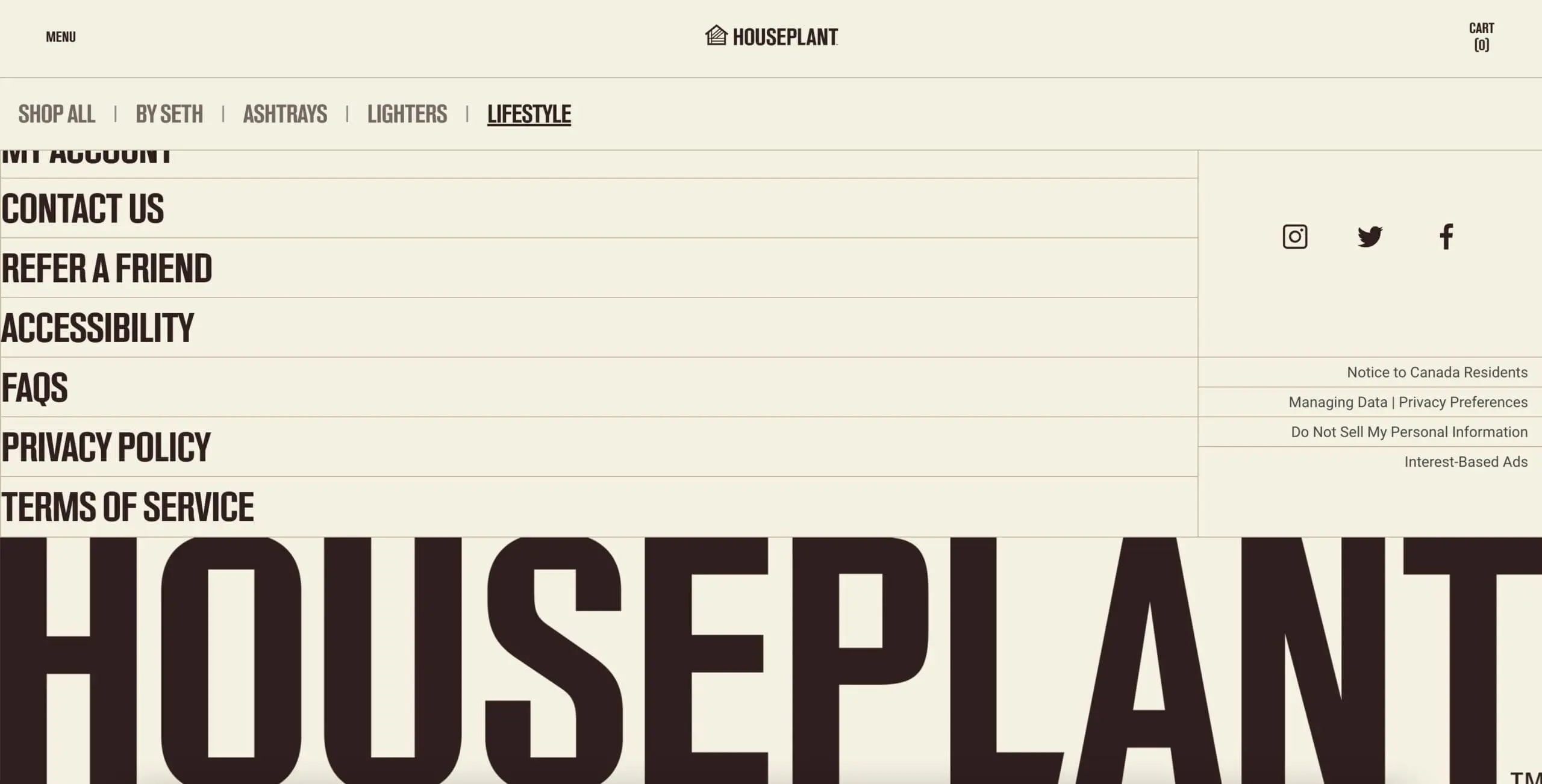
Houseplant offers smoking accessories like ceramic ashtrays, lighters, and home objects for “people who like nice things,” which is maybe a code word for cannabis. But that’s not the point. Notice the footer, especially the composition of the brand. The placement at the very bottom of the page, in bold caps, makes the word itself seem like a workhorse supporting the entire edifice of the website. Again, perhaps few will see it, but the visual message here evokes strength and solidity, which translates in the realm of non-verbal communication as trust.
At the very bottom, stripped away of all else, is the company. It’s a small gesture perhaps, but it does demonstrate how the footer can be arranged to deliver the kind of assurance that users seek. The tiered list of links to the left are also bolded and very conspicuous. This footer actually takes up a large chunk of real estate, but if a user is uncertain and roving for information, this footer suggests competence and open lines of communication. There are of course the ubiquitous icons for social media, which as we shall see get handled in many creative ways.
2. Chirpley
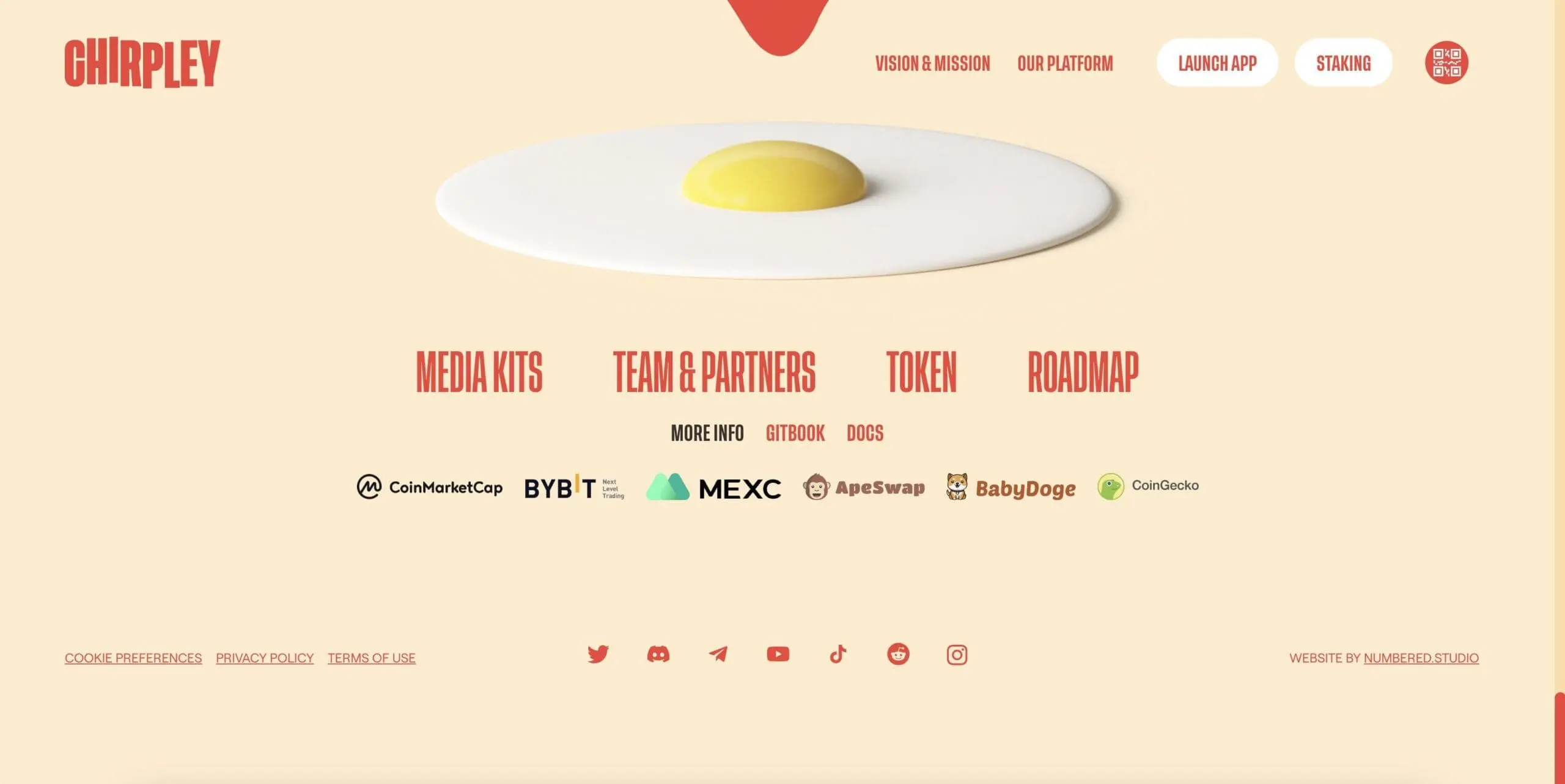
Chirpley offers an AI-powered platform for clients to use micro and nano influencers to move the marketing needle. The footer here, without the context, might seem a little too playful…an egg yolk. But it’s actually the ending to the narrative storyline that runs through the website. The “chirp” of Chirpley is of course birds…birds that sort of look like fish, but there are wings and who’s to argue with creatives.
The birds are the nano influencers that this platform can summon on your behalf to detonate what is called a “1 click marketing bomb,” shaped like an egg. The fuse is in fact lit midway through the scroll down, and so the egg yolk at the footer is an ironic statement and the proper finish of the narration. You’ll notice also at the bottom are the second offering of the social media sites that Chirpley works with. This same row was featured much earlier, because those are the tools that this platform will leverage.
The footer is the perfect place to amplify the core message of the website. The message works here as a story and as a CTA, but notice the social media icon not pictured: Facebook is omitted, replaced by Discord and Telegram. Again, know your clients and design through the relationship.
3. Magnetism
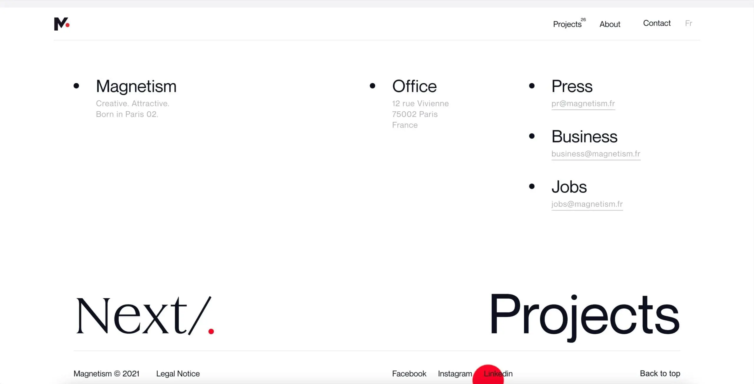
Here is a very different kind of footer, a minimal approach from Magnetism, a French creative agency. What’s missing is essentially almost everything. Most prominently vanquished are the social media icons. Highlighted instead are the various ways to contact the agency, from the very fashionable rue Vivienne address to the variety of email options. All well and good and very basic.
At the extreme bottom, in font that’s hard to miss and serving as potent CTAs, are Next and Projects. They are in fact links to the same thing, the agency’s portfolio. Let’s think through the design strategy. Instead of cluttering the footer with six icons to places like Twitter, Magnetism has saved the last goodbye for another ask to see what they do. If users won’t look at the work of the agency, maybe a Twitter link would close the deal, but really it’s a pointless gesture. This clean approach remains singularly focused on the most important framing device of the design, which is funneling potential clients to the portfolio and not to Twitter.
The rest of the website is a visual feast of vivid animation and stunning stills. If a user gets through all that, most likely they haven’t really checked anything in depth. The footer becomes that last chance saloon, which for a creative agency is all or nothing.
4. Discovered Wildfoods
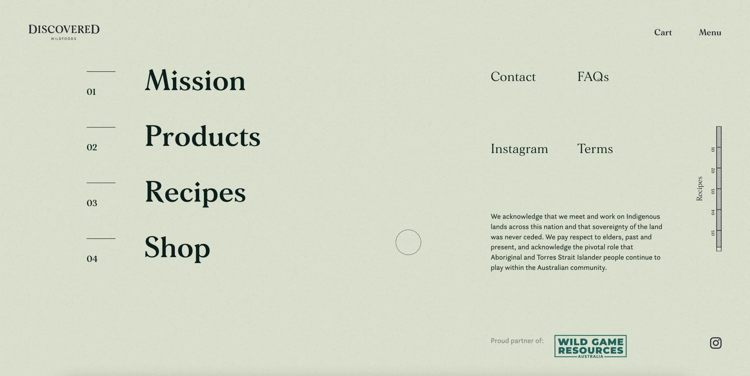
The morality of food sits at the center of Discovered Wildfoods, an Australian purveyor of “ethically harvested Australian wild game.” So meat-eating here belongs to an ecological tradition of sustaining habitat that supports the game, meat sources free of antibiotics and cruelty.
So the green motif, most evident in the lettering, speaks to the green impulse of the brand. So it’s quite intentional that the first link of the footer is for the company’s Mission, not something you’d normally see down below. Again, think of the footer as a chance to amplify the one message you want users to walk away with. In this case, Discovered Wildfoods angled to ensure that if a user scrolled all the way through the website, the mission would remain front and center. Only users who align with their ethics will take the next step.
This footer is an almost exact replica of the header, which makes sense because you want users getting to the Products. The one social media link–Instagram–is spelled out, with no icon. Since Insta invented food photography, this is a natural move. Plus, an icon would’ve muddied the old-school aesthetic enhanced with the gestures in the margins.
5. Curry Cafe
Staying Down Under, here is a footer from Curry Cafe, a Melbourne-based eatery that specializes in…curry. The theme of the website, the narrative thread, is Stay Spicy, and this footer brings home that point in an explosion of splashy colors and catchy animations. Bars scroll at top and bottom, almost a replica of the header, with a prominent mention of vegetarian and non-vegetarian items. The CTA is really just a telephone number, though the landing page does feature a chatbot that pops up immediately.
The links to the menu and on-line ordering are embedded in the vertically aligned borders, perhaps too embedded and overshadowed by the profusion of action. The Drinks Thums Up slogan refers to an Indian soft drink, and the Hindi script also sends a clear message to expat Indians that this place is a kind of refuge. The footer then stands as a kind of cultural signpost, a way to communicate with compatriots thousands of miles from home. This is another example of how the footer can serve many subtle purposes and isn’t just a place to dump icons and links. The best footers have a way of forging a connection at some level with a user who’s obviously looking for something.
6. K72
And then there was none.
One approach to the vexing problem of how to design a footer is to not have a footer in your design. At least, a footer as we have come to understand that term. Headers and footers are legacy idioms from the age of print media, where a typeset page of text had to identified top and bottom, according to arbitrary rules set by publishers. Page number, author, title, all had to go somewhere.
Web design mirrored this static way of presenting information, but what if you eliminated top and bottom? K72 has done something like this. Below is the “footer,” but really it’s a page users navigate to from a curious-looking hamburger (with two lines, one short and one long).

Because there is no footer on the landing page–it literally just scrolls in a loop, over and over again as seen below.
It is all a bit dizzying, even disorienting, to not know if you’ve looped back around or if there is NO FOOTER at all and if you keep scrolling, years could go by and you’d still be there, looking at AI-generated phrases. But this is perhaps a more honest portrayal of the web than the header-footer model dragged in from the past. The web has no beginning, no end, and so there’s no point in pretending that a “footer” is a kind of ending. Kudos to K72 for not abiding by convention.
But the human brain responds to a narrative and seems to apprehend information in a top-down style. Whether this is biological or cultural, who’s to say. But K72 is pushing the extreme of cognition by completely dispensing with a brand storyline and repeating the same sequence over and over again. Even the “footer” page that exists is stripped of all artifice, reduced to the raw essentials, with the social media links rendered in initials instead of icons.
As a creative agency, it makes sense to offer up a portfolio page that is so edgy that there are no edges. Just loop after loop after loop.
7. Shantell Martin
Shantell Martin is a British-born graphic designer, choreographer, performer, teacher, and philosopher, and if that sounds like a bit much, this is an artist who’s worked with Kendrick Lamar and North Face. Translation: her appeal is broad and yet refined, hard to categorize and yet filled with infinite possibility. Her one major theme is LINE, and she’s done amazing work in all kinds of media with that simple gesture.
Lines form a path, in her worldview. The footer to her personal website is the final touch to this most heartfelt mission: her rounded, expressive lines form questions from three-letter words: Who Are You? Are You You? Martin wants to leave the user with something to ponder, because as promised she is both teacher and artist, and here she is displaying two sides of her vision. The rest of the footer fills the traditional mission of links to social media and other pages on her website, nothing very extraordinary…but it’s the haunting questions that linger, that draw users into her story. Branding is more than getting clicks and harvesting data: you have to give to get, and website design that hews closely to the beaten path isn’t taking the right line (according to Martin’s vision of line and path, anyway).
Web design depends on lines that create a path. The footer is the end of the path and there needs to be a payoff of some kind, a surprise, a wrinkle. Martin reminds us that simple gestures have profound impact.
8. Style Novels
Luxurious furniture, catalogued on a website that’s drawing raves from design critics for its lush interactive gateway to the merchandise. Style Novels bills this journey as a “history of furniture,” told through three different paths that users can navigate: “the Colors of the Lake,” “a small secret Garden,” or “a journey of the Eyes.” The furniture is then positioned within a narrative that users become immersed in, a cohesive installation that is beautifully rendered and each of which ends with the same footer, bifurcated into two sections.
Below is the top half of the footer. You can see that it’s quite standard, a robust CTA for a catalog request. And nothing more. No social media icons or any other visual clutter. It fits into the carefully curated visual palette that the website adheres to on all three pages. But there is a second half to the footer.

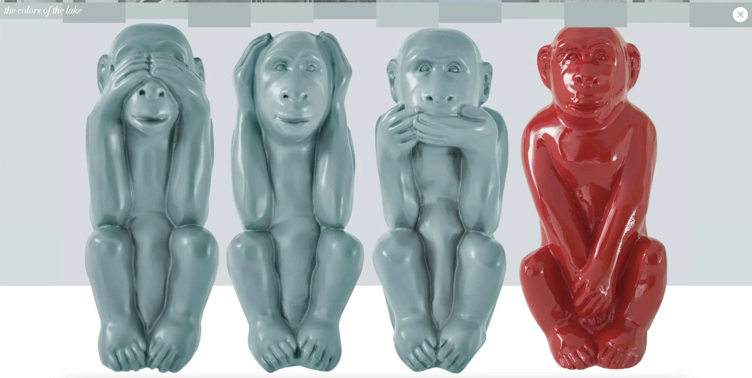
There it is, below. Four primates in the familiar poses of See, Hear, and Say No Evil, along with a fourth monkey that looks to be in some kind of gastric distress. This is the very bottom of the footer, the very last visual element that users would encounter…and it’s there largely to bring some mirth to what is really a meticulously built website, almost fantastical in scope. This last image isn’t a CTA, of course, but an attempt to form a confederacy with the user. After all, when two people are in on the same joke, they share a bond. The best footers summon some kind of emotional response from users.
9. Mana
Mana sells yerba mate, a caffeinated drink that originated in South America. It is akin to the Black Drink, derived from a holly plant, that native people in Florida consumed. The consumers of the product aren’t necessarily part of the mainstream, and Mana’s footer acknowledges the alt lifestyle element of its brand.
In many ways, this footer toes the line of tradition, with social media icons arrayed to the left and the more typically business-oriented links to the right. These functions of the footer are very well-known, but what about the rest of the space? How can the footer be recruited to aid in the development of a brand?
Animation. It’s a must-have for certain marketing strategies, and in this case, the animation is amplifying the celebratory mood the website creates from top to bottom. The character in blue appears on the landing page, and since the footer represents the end of the story, here is the end: a happy, satisfied consumer just bopping down the street. The juxtaposition of the s-shaped curve with the straight line provides a nice contrast to keep users locked on the animation. Users will come away feeling justified by their allegiance to the brand.
10. Health by Habit
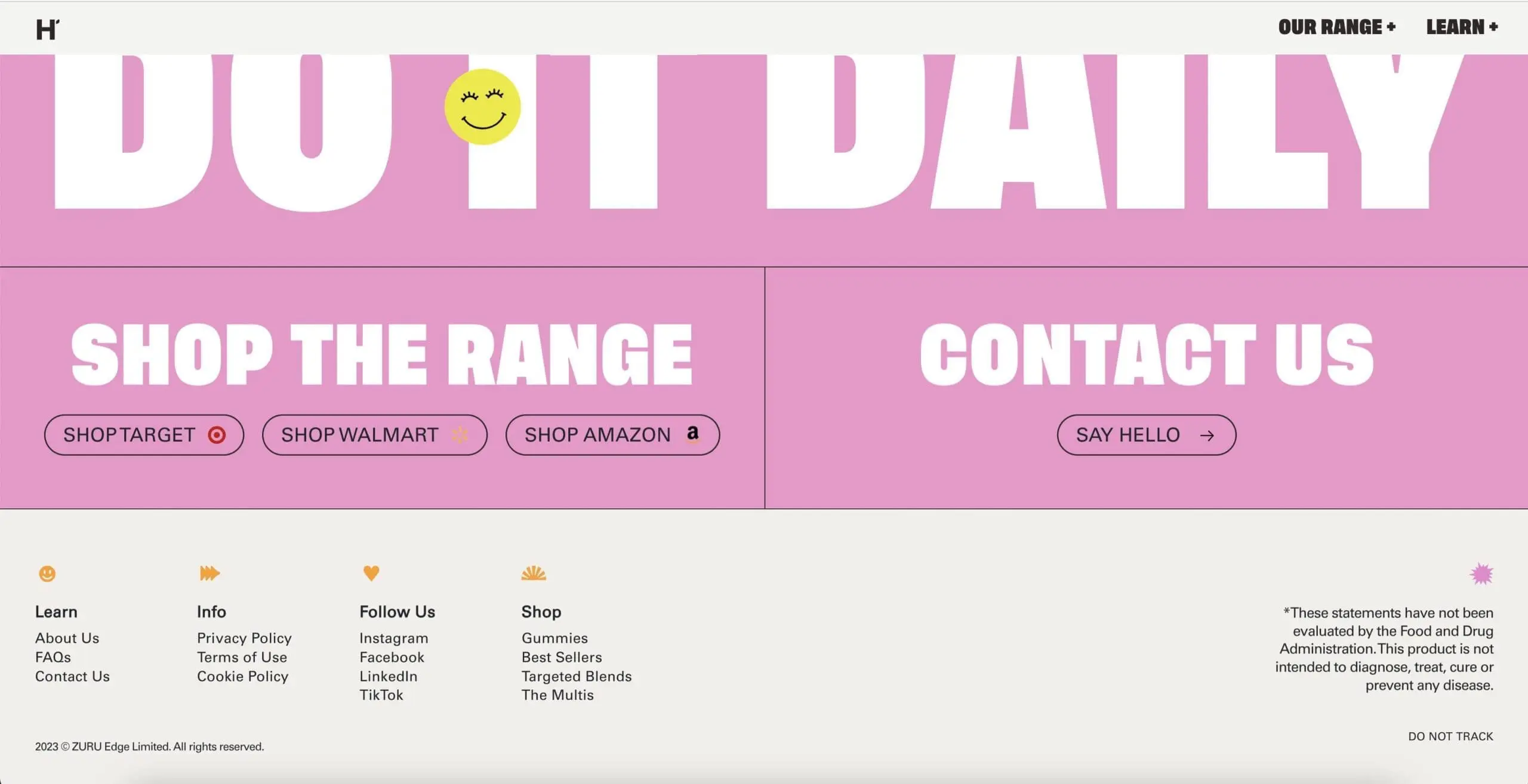
When you’re in the health sector, your footer should fold into a larger construct of trust and empathy. Health by Habit sells vitamins, but with a stated claim that health should be something equitable and affordable. Users embarking on the narrative journey of the brand will see a very smoothly executed rollout of the products and the philosophy of the company, and the most prominent piece of information being shared is that the vitamins are available in both Target and Walmart.
Target and Walmart: the middle of the middle of the road, and it’s a huge selling point for this brand. Hence, the footer circles back to these two retail giants and the CTA really is focused on the reliability of two of the biggest chains around. Just in case a user might be straddling the fence, there is yet another concrete reminder that these vitamins should be trusted.
Again, nothing earth-shattering here. Most web designers would’ve offered this solution. It’s a pretty staid footer, because it has to be. Convincing a user to ingest a vitamin is the ultimate act of trust, and so the footer isn’t the time for an animation or ironic nod to an inside joke when your business involves health and wellness.
11. Alba
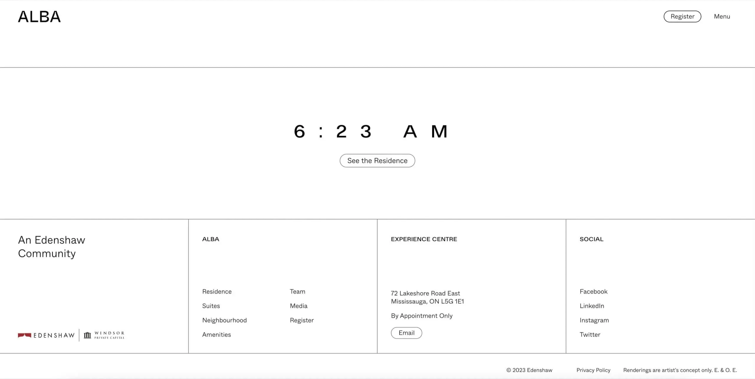
Below you might think: what an ordinary footer, what’s to learn from this tried-and-true layout?
Ok, most of this footer from Alba Condos seems rather pedestrian. Neat boxes where the usual links are nested, all arrayed logically and easily found. This is what footers are supposed to do–offer guidance to the users who might be “lost.” This footer is the typical lifeline, with one exception: the time of 6:23 AM.
What an odd thing to place in a footer, but here is the valuable lesson that’s worth remembering. That time is a loop back to the top of the landing page, where the journey began, bright and early in the morning. Each facet of the condos has a time associated with it–like Amenities at 5:28 pm, when you’d be coming from work and needing some R and R. It’s a very explicit narrative around which the entire design is built.
Basically, putting 6:23 AM in the footer is really a “Back to Top” button, but much more clever. Users who have taken the entire 24-hour journey must’ve found it compelling to have landed in the footer–why not take another perusal through what downtown Toronto has to offer?
It’s tempting to use familiar buttons like “Back to Top” or “Top,” but if you can re-imagine the familiar and make it seem new, you can really startle a user whose eyes have begun to glaze over.
Exit Ticket
A footer should be a miniature of the website as a whole, or so goes one school of thought. But that approach can become awfully narrow. If every design took that view, there’d be less variety and fewer risks being taken. It’s better to look at the footer as the final piece of the puzzle, with some kind of payoff or invocation of the major theme.
There’s no doubt that users need to find relevant information in a footer, but as we’ve seen, there are ways to offer that kind of service without overwhelming the user visually. If you understand who your potential customers or clients are, you can better serve them by delivering what they need and not throw the kitchen sink at them.
The best footers give to get. They offer an emotional bond, an inside joke, reassurance, a lesson, a sense of community, AND any pertinent contact info that users might be seeking. Shantell Martin believes that lines matter because they become paths we follow. The footer is the end of one such path. Make sure it doesn’t end with a shrug.
At Hey Reliable, we’re experts at turning designs into functional reality using HTML/CSS, React/Vue, WordPress, Contentful, and Craft CMS. Say goodbye to coding headaches and partner with a team that understands your vision. Let’s bring your design ideas to life and make your brand shine, down to the last pixel. Let’s get started.
Get started now
Start with a risk-free, no obligation proposal delivered to your inbox in one business day or less.
Get Started- 5-Star Rated Technical Partner
- 100% White Label - Sign our NDA
- 90-Day Code Guarantee


