When it comes to mobile-first design, allow KISS to take center stage.
Not Gene Simmons and his elongated tongue. Not the band with the face paint and the pyrotechnics. We’re talking about another kind of KISS. The acronym of sage advice that can be applied to many of life’s vagaries.
Keep It Simple, Stupid.
If you do that, then you can rock-n-roll all night and party every day, because chances are, you’ll be delivering popping UX that’ll leave your clients yelling for an encore. But since Forrest Gump told us that stupid is as stupid does, we should figure out how to do stupid the smart way.
A Word about Degradation
Before we can get really stupid, we should recall how and why “mobile-first design” became a best practice to ensure that UX remained consistent on every device. Therefore, we need to understand “graceful degradation,” which might sound like an anti-aging clinic in a strip mall but instead is the design methodology where designers first build out the largest screen (a desktop) with maxed-out features and content. The next steps involve jettisoning said features and content to fit increasingly smaller screens so that what ends up on a mobile device can become an ungainly version of the original.
Understandably, this approach is frowned upon for the obvious reason that mobile UX comes as an afterthought. With projections that in 2025, 72% of users will access the internet on a mobile device, treating the mobile landscape as a poor stepchild of a “real” desktop website is a very poor strategy.
Start Small
In fact, the opposite approach has taken hold, called “progressive advancement,” where designers begin to mock up prototypes on the smallest screen, which would be a mobile device. Facts on the ground pushed this change: in 2016, mobile internet usage surpassed desktop.
Then in 2019, Google began using “mobile-first indexing” to determine the page rank of websites, thereby putting mobile content and UX at the very center of how its algorithm operates. The fate of businesses now rested in the hands of web designers who had to account for various screen sizes or risk falling down many notches on the world’s most used search engine.
And when designing for the smallest screen first, you need to follow KISS.
How to Keep It Simple
The first key to keeping it simple is to understand that at the mobile level, content is the be-all and end-all. There isn’t physical space or bandwidth to spare, so you can’t make things extra with desktop-friendly tricks like hovers and fixed navigation menus. Mobile UX depends on straightforward delivery of the most essential elements that you need to build a relationship.
Putting the user first is another key element of mobile-first design. Anything distracting, slow, or annoying will send users fleeing and your bounce rate skyrocketing, and so the progressive advancement approach forces you to question every idea you have about font, whitespace, promotions, and color contrast. This is actually a very positive side-effect of starting small first. You must drill down to the most primal level of your design intentions and eliminate anything that mars mobile UX.
That means paying attention to the visual hierarchy of your image flow so that users can immediately understand what your page is all about. No more than two columns, whitespace and borders that make the content layout neat and orderly, a font that isn’t too small, and a navigation menu that collapses and isn’t overly stuffed with links.
Any CTA has to be big enough for a thumb (not a desktop mouse) to press down on and also bold enough to be obvious to the user. If your “Add to Cart” CTA is hidden away, users won’t buy and they won’t come back. Once again, be stupid and keep it as simple as possible.
Some Caveats
Even though keeping it simple sounds, well, simple enough, there are some important caveats to consider before you go 100% stupid. In 2010, Google’s Eric Schmidt cautioned that “You should always put your best team and your best app on your mobile app,” which signaled to web designers that going forward, Google would focus more on mobile users as it calibrated its search rankings.
So you should think of the mobile version of your website as an app, in which users have certain expectations about control. But this ecosystem is very limited and so “putting your best team” on it and “keeping it simple” are all reasonable pieces of advice, but the reality is far more complex.
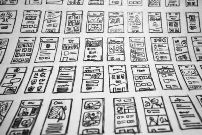
Simple isn’t easy. Simple means prioritizing your content in a spreadsheet and then wireframing a prototype that has visual appeal and functionality while staying on-brand and not being derivative. You have to avoid large graphics yet infuse the screen with purposeful and powerful imagery. You can hide a navigation menu in a hamburger, but then studies have shown that user engagement decreases using that fix.
Stay Stupid, Friends
Inventing “simple” solutions to complex problems that involve how irrational actors (human users) interact with technology is a design challenge that won’t ever end. Mobile-first design is really a philosophy, a way of seeing the world and the means to understand it. Mobile-first will only grow in importance in the years to come, and so nailing it down will require a sustained effort to remain insanely creative.
But creative within certain confines, akin to writing haiku poetry with its strict 5-7-5 syllable structure. Much bad haiku sounds the same, but brilliant haiku transcends the limitations of the genre. Mobile-first design must occur within a small space, but a small space of infinite power.
YOU MAY ALSO ENJOY


