
When it comes to mind-blowing web design, the head is the heart.
The header of a website is a thin ribbon of real estate that runs along the top of the screen. Because the eyes of a user will fall here first, the elongated rectangle plays an outsized role relative to the space it takes up. It’s literally the head of a website, meaning that it contains the “brain” of the brand, but because visual imagery exerts such irrational power, the heart is located here as well.
The heart, as in an emotional connection delivered through clever and authentic visual cues. The brain, as in the navigational nervous system will guide users through a journey. Both coexist in the header, and it’s this spatial interchange that separates great websites from good ones.
The heart has reasons that reason cannot understand. Not to name-drop some Pascal, but it’s worth pondering this aphorism, especially as it relates to the design of headers. Many blogs will trot out truisms about how headers must perform certain critical functions, which is undoubtedly true. But the design of a header is ineffably complicated and can’t be reduced to a set of rules. Once again the battle between form and function will result in glorious victories and stinging defeats.
So let’s head out in search of headers that move the design needle. Some headers are real headscratchers, while others deserve heady compliments.
1. Marble
Our first stop is with Marble, a New York-based fashion brand that started in 2003. It’s a retail business, and thus its header will offer a few object lessons in functionality.

The brain of the header is quite evident, and it’s twice the size of an average brain, because this header consists of two horizontal strips instead of one. But retail has a different set of dictates that web design must follow, and if you need any evidence of where the most important elements are, just begin at the top left.
What you don’t see is a logo. Most web designers would place a logo there since users tend to “see” a website from that spot first. But Marble, being a retailer, has gone a different direction. Contact information occupies the top left: a phone number and an email address because customer service demands instant apprehension of contact info.
But equally critical is the scrolling of sales promotions, the dollar-sign appeal to attract bargain hunters. An X to the far right will collapse this top bar, leaving the lower header where the Marble logo bifurcates text on one side from icons on the other. The Shop tab expands into a mega menu, and the icons are each a kind of call-to-action. Notice how the icons aren’t radical renderings but traditional motifs easily recognizable by the average human.
But there is no central CTA here, since retail centers on shopping and customer service, and one can’t take precedence over the other. In some ways, this is a maximalist header, stuffed with information that a user might need very quickly.
2. Hiyo
Hiyo is also a retailer (of beverages), but this header takes a few interesting turns. Like Marble, the header seems to double up, a scrolling layer atop a static one.

The creamy top banner announces “all flavors back in stock,” a subtle reminder of Covid-created shortages. The lower banner, however, doesn’t look like a header at all. The image of the pouring can, which suggests a horizontal orientation, folds into the text of a traditional header, featuring the usual tabs for Shop, Merch, Story, etc. At far left, as is the custom, sits the logo, the heart of the brand, balanced by the icons at the far right.
But the legerdemain of the can morphing into the header serves to expand the playing field, so to speak, to enlarge the landing page while also serving the important navigational roles that a header must provide. Sometimes it pays off to blur the lines between header and body.
3. Cardrona Distillery
Another example of how to integrate a header into a larger visual field can be found on the landing page of Cardrona Distillery, a New Zealand-based purveyor of spirits. While some web designers will suggest a color contrast between the header and body of at least 4.5:1, here you can this advice completely rejected.

There is no contrast at all. The magical blue sky lifts up spiritually from the rugged terrain into a star-dappled vista. To insert a traditional header here would be to stagnate the flow of the user’s eyes to reduce the suggestion of infinity to a defined space. In short, it would’ve stunted the brand.
Instead, the elements of the header sparkle like stars in the firmament. The logo occupies a traditional spot in the left corner, and the CTA sits on the opposite end. The header looks familiar to anyone who’s ever surfed the web, but the designers didn’t hew closely to the “accepted wisdom” of color contrast. They found a solid artistic reason not to, and the result is a stunning merger of brand with locale and emotional resonance.
4. Backcountry Gear
Nowhere is the brainy part of a header evident than in the design of Backcountry Gear, an outdoor sporting goods store in Eugene, Oregon. The serious shoppers who visit this site aren’t just idling away dull hours. They are looking for something specific for a hellacious adventure. These are intense folks (or intense-adjacent) who do extreme activities wearing really cool clothes.

Hence, the header here is mostly brain. If you want to see how a dropdown menu can max out, then check out the tabs. Each one unfurls into a dizzying array of gear so that basically the entire website can be navigated from the header. The UX here might be off-putting for those more sofa-inclined, as those who are just browsing might get overwhelmed.
But with people who ski down mountains, there’s no reason to beat around the bush. Knowing what your users want is key to creating a design that marries function and form. The one piece of heart in this header is obviously the logo, again placed in a traditional spot. The header does an excellent job of reflecting what users see in themselves back at them, like a mirror that projects idealized notions. The eleven tabs run the gamut of the retail experience. The topmost banner dangles special offers and contact methods.
The lesson here: if you need a big brain, don’t be afraid to build one.
5. Likely Story
Maxing out is important when you have a ton of gear to sell, but minimal might work better if your brand sits more on the creative side. Take a look at Likely Story, a UK-based “web and brand experience” studio that has positioned itself well within the boutique space.

The header in this design barely functions as a brain, with just three text tabs to the far right. Eschewing a CTA of any significance, the header exists more as an idea, a notional nod to the traditions of a header. There is no rectangle, no color contrast, just the logo in white font jauntily arranged akimbo, followed by a long strip of nothingness, punctuated by three tabs, none of which demand a user’s attention as a CTA.
But this approach is hardly revolutionary. Many creative branding shops have headers that are short and sweet. The basic message is: this is who we are, this is what we do, and this is how to reach us. It’s a kind of punk-rock ethos that pervades online creatives.
The hook is the imagery on the landing page, the incredibly inventive work that draws the user in. A header should be as innocuous as possible, the bare minimum once clients take the bait. One thing all web designers can agree on a header should not get in the way. In most cases, meek and mild will succeed just fine as long as the other design elements pop.
6. Handmade
But minimalism can get less cluttered, apparently, judging from the header of Handmade, a web and mobile app development agency. The header here consists of the logo on the far left and the hamburger menu on the far right. In between, a strip of infinite blackness.

What’s risky here is that the design doesn’t seem to align with the brand. Nothing in the header suggests “handmade,” and there is literally no heart, almost as if the designer wanted to eliminate the header altogether but couldn’t really justify it. Not that risks aren’t worth taking. The envelope needs to be pushed, and it’s hard to imagine how much more reduction the header can undergo than what we see here.
7. FFFACE
What happens when you collide the brain with the heart into a header that exudes technical virtuosity? We end up with something like FFFACE, an XR and Web3 product house. We’ve officially arrived at the cutting edge of the cutting edge. What’s happened to the good ole header from grandpa’s day browsing on AOL?
It turns out, a lot. And in some ways, very little. Let’s start with the innovations.
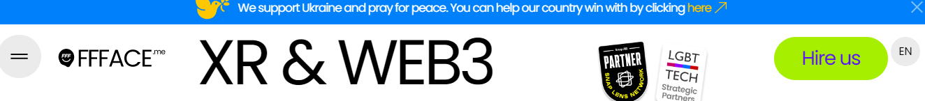
Let’s start with the two-layer banner. The top is blue, as is typical, but instead of reduced shipping rates or prices slashed to the bone, we get a prayer for peace in Ukraine. The logo featured isn’t from FFFACE, but instead comes from Woodstock: a dove of peace.
Right away the header positions the brand as firmly planted on the side of social justice. If there was any question of the bona fides of FFFACE’s commitment, the lower half of the header features two endorsements: one from LGBT Tech and the other from Snap Lens Network. These are testimonials that might have been found elsewhere in a website, not featured in a header. But the ethos is very much a branding opportunity and a way of finding clients who will be compatible from the start. They’re wearing their heart on their sleeve.
You’ll also note that the header has been “invaded” by the headline of the landing page, an incursion that acts as a divider between the logo and the CTA (Hire Us).
The hamburger menu to the far left translates well to a mobile version of the website, as clicking on it will bring users to a matrix of links to explore, all visually stunning. The trend towards hamburger navigation is in no way slowing down, and its evolution in design will forge new trails.
But the neon-green CTA is very much old-school, almost ironically so. “Hire Us” is in a color that really stands out, and the garish color alone draws the user in. This is what CTAs are supposed to do. It’s what CTAs have always done. This nod to an OG CTA adds a texture of nostalgia to what otherwise if the future is unchained.
8. Invoq
Commercial ovens, go! What comes to mind? Big hulking beasts that heat up fast and cook ridiculous amounts of food. But a good web designer can take something as prosaic as an oven and elevate into a kind of postmodern statement on foodways.
That’s what happens at Invoq. The commercial oven becomes a sleek piece of technology, and the transformation starts right at the header.

What’s different here is that the header is part of the dazzling animation that is the crown jewel of the landing page. The Invoq oven is a wondrous creation, as beautiful as a Bauhaus sculpture. The header floats into this video space with three spare words: Combi. Bake. Launch.
At the center is Bake, which serves as a CTA more than the white Contact button. This is where text placement can underscore the aesthetic intent of a design: too often, the text tabs in a header are spaced haphazardly without a specific purpose. But when you think of how words are symbols, Bake is really the best choice for the middle. A less confident design would’ve substituted Products for Bake, which would’ve lessened the impact.
More impressive is how the header aligns with the overall visuals of the landing page, which in turn perfectly captures the brand of the Invoq oven. The three elements are in harmony, and this balance is a hallmark of excellent design. The header literally looks like part of an oven.
9. Meta Trak
Getting your car stolen is a huge bummer, but with today’s technology, there are ways to thwart thieves. That’s the business of Meta Trak, which offers stolen vehicle tracking solutions. Even before you look, you can imagine the job of the web designer: to inspire confidence and generate secure feelings.
This isn’t retail per se, more of an SaaS offering but one that comes loaded with emotional baggage. The header will have a big brain, no doubt, and plenty of heart, too. Because there are just so many pieces to this puzzle, the design here went in a novel direction: two CTAs.

Usually, you want a web page to really tell one story that ends with the CTA. Plot twists don’t really work when narrating a brand with visual cues. One prominent CTA, that stands out in some way, is what good UX aims for. Anything that steps on the CTA diminishes its impact.
But you’ll see that Meta Trak has opted for two elements to be boxed. One in red is “Become a Dealer” and one bound in white is “Login.” They also happen to be side-by-side. It’s easy to understand why a designer might elect this solution. The need for dealers is enormous in this business model because otherwise, they won’t survive unless dealers are upselling.
Equally critical is getting existing customers to use this app. The fact that one is in red might allow that the “Become a Dealer” is the real CTA, while the “log in” button is a courtesy. Perhaps. But the human brain doesn’t necessarily process visual information in this logical fashion. The two boxes perhaps could’ve been separated, with the “log in” placed by the logo for symmetry. But log-ins often sit far right…so sometimes you need to break the rules, especially if the client has needs that go beyond selling a service or product.
10. Nightjar
Some of the best use of headers involves making them sticky so that they don’t disappear when users start scrolling.
Sticky headers, though, can take up valuable space, especially if users think that the header is getting in the way. On the other hand, a sticky header can help with site navigation when users scroll down and then need to scroll back up to figure out how to shop for a product on the site.
Mostly, in that case, they bounce. And bounce rates that get too high mean you aren’t converting. So let’s see how a sticky header can perform some artful tricks to help maximize UX. Nightjar, a UK-based experience design studio, uses a sticky header, but one that expands and contracts.
Here the header is as it appears when a user lands on the page:

You’ll notice right away some choices that are unique. First, the text is unbalanced. The logo sits far left, then comes Subscribe, with Showreel in the center. All good so far. Then there is a blank space until the Work tab far right, and instead of a hamburger menu, users see the full array of choices running vertically down the margin.
Horizontally and vertically, the header rejects symmetry. This is a conscious decision to let clients know that they will experiment with form and fear will not cow them. The brain is on full display, and the heart beats wildly, ready to explode accepted wisdom.
When users begin scrolling, however, the header changes to this:

The sticky header becomes less intrusive when users actively engage the site, and in fact, this shrinkage reveals a far more conventional header with lots of white space for punctuation. There are no visual elements that might distract users from other content, again showing how headers should do no harm.
11. Haywood Golf
Headers are almost always at the top of website, but there are exceptions. The vertical alignment of a header can work depending on the context of the brand and how the design fits into a broader strategy.
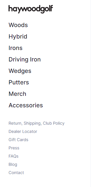
Going vertical is a radical orientation, but one that users are used to from many social media sites, not to mention Gmail or Outlook. In some ways, it might feel more natural to users to look for navigation on the left, with menu options sitting beneath a logo, as is seen in the example of Haywood Golf.
But why would a company or business decide to choose a vertical approach over a more traditional horizontal feel? More importantly, how can web designers convince clients to pick this unconventional path? The best argument to make is that the business model demands it. A company that offers many specialized products, too many to list across the top, would have to use a vertical orientation.
Users arriving at Haywood don’t want to click through Golf Clubs to Putters…they want to jump directly to Putters. You could argue that a drop-down max menu would be as effective, but there would be wasted seconds. A wine retailer wouldn’t have Wine as a tab or even Reds. It’s all about conversion, and part of that is UX. If users think something “takes too long,” they’re long gone.
Lessons Learned
Web design has to juggle more balls than a clown under the big top. Getting the header right is critically important because getting it wrong could be disastrous. The header has many functions to attend to, and it’s easy to overload this rectangle to the point that users just tune everything out. The best headers align with the hero block, which in turn amplifies the brand in a meaningful way. There is a seamless flow between the header and the aesthetics that guide the visual elements of a website.
Want to take your website headers to new heights? Hey, that’s our thing! At Hey Reliable, we’re experts at turning your designs into living, breathing, totally-awesome headers. Wave goodbye to the coding stress and let’s start this adventure together. Ready? Let’s do this.


Get started now
Start with a risk-free, no obligation proposal delivered to your inbox in one business day or less.
Get Started- 5-Star Rated Technical Partner
- 100% White Label - Sign our NDA
- 90-Day Code Guarantee