

WordPress
Special Offer on WP Maintenance Plans + Free Core Web Vitals Audit

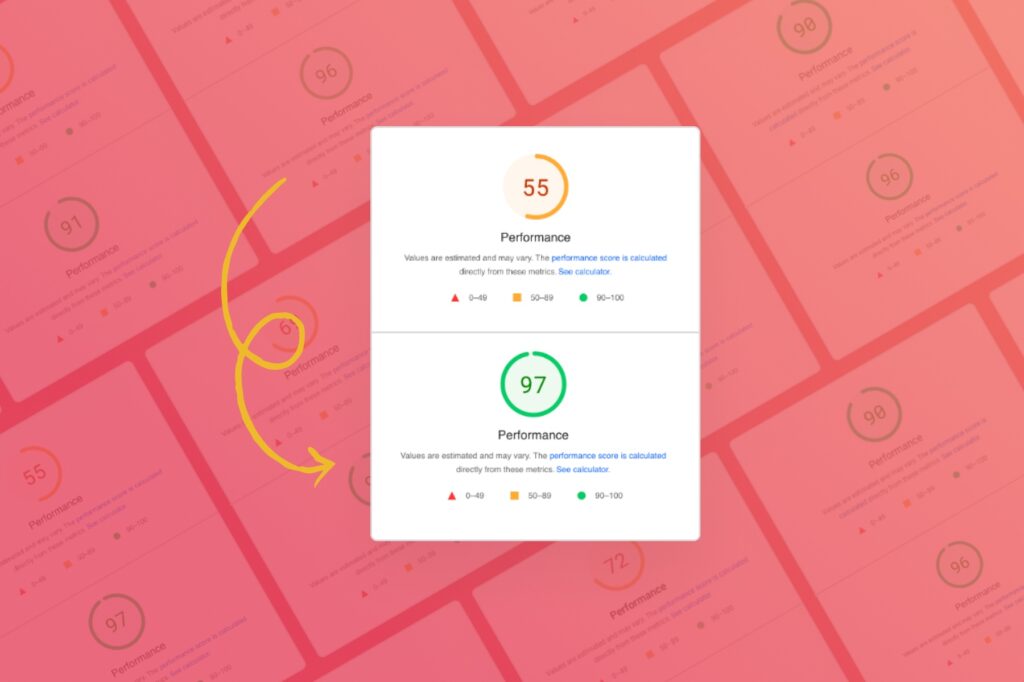
As you probably already know, site speed is a significant ranking factor in Google search results and having your site score well in Core Web Vitals is more important…
Recent Posts

Hey Reliable
Why Treating Vendors Well Is Good Branding
When I was an early twenty-something in college, I worked in restaurants in the...
Resources
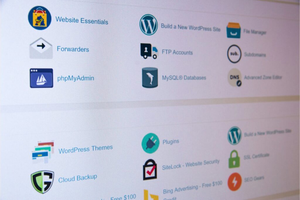
How to Grant Hosting Access – A Complete Guide
Reaching the stage where your project is ready for launch or requires updates is...

Design
11 Website Header Designs That Are Ahead of Their Time
When it comes to mind-blowing web design, the head is the heart. The header...
Design
Don’t Fret the Footer: 11 Footers That Show Fantastic Web Design
Explore Hey Reliable's insightful guide on innovative web design through 'Don't Fret the Footer,'...
Hey Reliable
Say Goodbye PDF Proposals – Our WP Proposal Plugin Is Coming Soon!
We’re turning our custom tool into a slick, easy-to-use WP proposal plugin.

Design
Minimum Viable Product and Lean UX
When you want to assure clients that you are careful and efficient in your...
Resources
6 E-Commerce Trends We’re Watching
You live in a cabin in Vancouver, your customer lives in a flat in...
Design
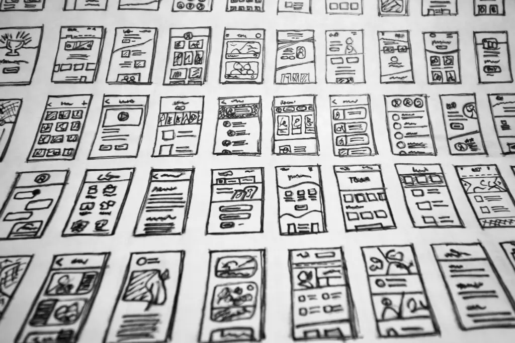
How to Use Wireframes to Create the Best UX
“It’s all about the journey, not the destination.” Or so say many new-age philosophers....

Design
How to Get the Best UX from Control Components
Beware the button, Shakespeare never wrote. But if the Bard was a web designer,...

Design
The Best Method for Mobile-First Design
When it comes to mobile-first design, allow KISS to take center stage. Not Gene...
HEY RELIABLE
Hey Reliable
Why Treating Vendors Well Is Good Branding
When I was an early twenty-something in college, I worked in restaurants in the...
Hey Reliable
Here’s What’s Cooking at Hey Reliable
Over a year ago, we changed our name from Reliable PSD to Hey Reliable....
Hey Reliable
New Year, New Reliable
Hey Clients! Happy New Year! This is a time for fresh starts, and in...

Hey Reliable
Hey Reliable’s 2023 Roadmap: What’s Coming Next
At Hey Reliable, we’re always working hard to make sure we’re providing the best...

Hey Reliable
Reliable Stands with Ukraine
Friends and clients, As the manager of a distributed, global team, it is my...

Resources
Remote Control: How to Work from Home Without Getting Lost
Working remotely: it can feel like being stranded on a deserted island if you’re...

Design
10 Podcasts for Designers
The time-management gurus all agree: if you want to augment your life in meaningful ways, listening to podcasts while commuting to work or walking the dog is one of…
WORDPRESS

Resources
Not Receiving Form Emails in WordPress? Here’s the Fix.
Often times when we launch a website, one of the first things we hear...

WordPress
Is Elementor the GOAT?
Chuck D Was Right Don’t believe the hype, rapped Public Enemy. But today hype...

WordPress
Off with Their Heads! What “Headless WordPress” Can Do…and Can’t Do
In Scottsdale, Arizona, is a cryogenics facility where the heads of 168 deceased people...
Resources
How to Grant Hosting Access – A Complete Guide
Reaching the stage where your project is ready for launch or requires updates is...
WordPress
WordPress Page Builder Plugins: Which Should You Choose?
It’s no surprise that WordPress is one of the most popular website tools out...

Resources
The Reliable WordPress Website Launch Checklist
The big day is finally here! Congratulations. You’ve made it through website design, development,...

WordPress
The Future Is Now: AI and Blogging on WordPress
Examine the integration of artificial intelligence in WordPress blogging, highlighting its impact on content...
The Ultimate Collection of Google Font Pairings (Displayed Beautifully with Classic Art)
Welcome to Hey Reliable's Ultimate Collection of Google Font Pairings and Combinations.